The paper a job is printed on does more than people give it credit for. It shapes how the finished piece feels in the hand, how the colours sit, how well it lasts and what it costs. A flyer on flimsy stock feels like a throwaway, and the same design on a heavier sheet feels like something worth keeping. Yet paper is often the part of a print job that gets the least thought, usually because the terms around it, GSM, coated, uncoated, can feel like jargon. Once those terms make sense, choosing the right stock becomes straightforward, and it is one of the easiest ways to lift a piece of print.
What does GSM mean?
GSM stands for grams per square metre, and it is the standard way of describing the weight of a paper. The higher the number, the heavier, and usually the thicker and stiffer, the sheet. A sheet of everyday office paper sits around 80gsm, a quality letterhead nearer 120gsm, a flyer around 150gsm, and a business card up around 350gsm. It is the single most useful number to know when you are talking to a printer, because it sets the tone for everything else about how the piece will feel.
Weight is not quite the same as thickness
GSM measures weight rather than thickness exactly, and the two usually go together but not always. Some stocks are bulkier than their weight suggests, which makes them feel more substantial without adding cost, and others are denser and thinner for the same GSM. For most jobs the weight is a reliable guide, but if thickness matters, for a cover that needs to feel rigid or a card that has to stand up, it is worth asking your printer about the calliper, the actual thickness, as well as the weight. Two papers at the same GSM can feel quite different in the hand.
Common weights and what they suit
Each band of weight has jobs it does well. Lighter stocks of around 80 to 100gsm suit the inside pages of brochures, everyday letterheads and compliment slips. The 120 to 170gsm range works for flyers, leaflets and posters, heavy enough to feel considered without adding bulk or postage. From 200 to 250gsm you move into light card, good for folders, covers and premium leaflets. Above 300gsm you are into business card and postcard territory, and the heaviest boards around 350 to 400gsm are where invitations and luxury pieces sit. Picking a weight is really about matching the feel to the purpose, and to the way the piece will be handled.
Coated or uncoated?
Beyond weight, the biggest choice is coated or uncoated. Coated stocks have a surface layer that holds ink crisply on top of the sheet, which gives sharper images and stronger, more vivid colour. They come in gloss, silk and matt finishes, from high shine through a soft sheen to a flatter, more refined look. Uncoated stocks have a more natural, tactile surface that takes ink into the fibres, giving a softer result that is easy to write on and pleasant to handle.
The practical point to know before you sign off artwork is that colours print a little more muted on uncoated stock, because the paper absorbs some of the ink. A design that looks punchy on a coated proof can come back softer on uncoated, so it is worth picturing the final stock when you set the colours rather than judging on screen alone.
Specialist and sustainable stocks
Past the standard ranges sit the specialist stocks. Recycled papers have come a long way and now print beautifully, which makes them an easy choice for brands that care about their footprint and want it to show. Textured and tinted stocks add character to invitations and premium packaging, and heavier boards give structure to anything that needs to stand up to handling. The trade-off is usually cost and printability, since some specialist surfaces hold ink differently, so it pays to see a printed sample on the actual stock before committing a whole run.

How stock and finish work together
Stock and finish are a pair, not separate decisions. A lamination, a spot finish or a foil behaves differently on coated and uncoated paper, and on different weights, so a finish that looks right on one stock can fall flat on another. A soft-touch laminate on a heavy board feels luxurious, and the same idea on a light sheet can feel thin. Thinking about the stock and the finish together, through proper design for print, avoids a result that looks right on screen but disappoints in the hand.
Matching stock to the job
The right stock comes from thinking about how the piece will actually be used. A menu handled by dozens of diners wants a wipeable coated stock or a protective laminate. A luxury brochure wants weight and a tactile finish that rewards picking it up. A high-volume flyer wants a sensible weight that protects the budget and keeps postage down. A business card wants enough board to feel solid in the hand, since that first physical impression does a lot of quiet work. There is rarely a single right answer, but there is usually a best fit once the use is clear.
Get a sample before you commit
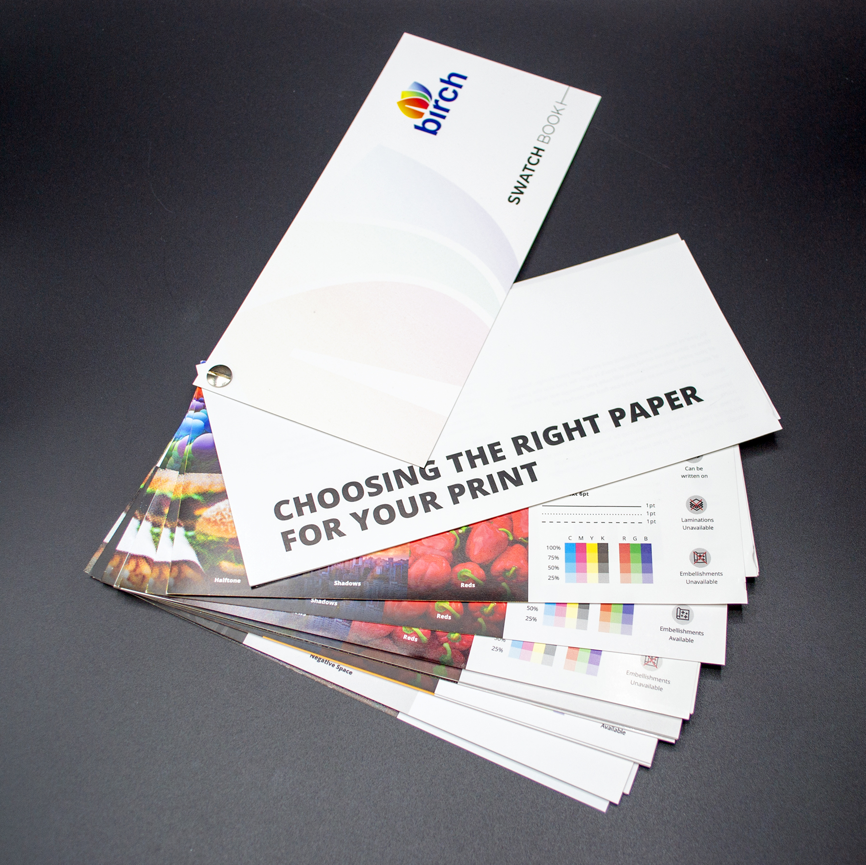
Paper is one of the few things in print you can judge far better by touch than by description, so the safest step before a large run is to see and feel the stock in person. The team at Birch can recommend a weight and finish to suit your job and budget, and check the choice as part of quality assurance before anything goes to press. Get in touch through the contact page to talk through the options for your next project. We can also supply a copy of our paper weight swatch book on request (featured in our main image).