

Most people choose a print finish the same way. They flick through a sample pack, find something that looks or feels good, and go with that.
The problem is that a finish chosen in isolation, without thinking about the end use, the substrate, or the artwork, can cause as many problems as it solves. The right finish for a luxury brochure is not the right finish for a counter card. What works on silk coated stock will not always work on uncoated. And some finishing decisions cannot be reversed once artwork is signed off.
This piece covers the main options and what they actually do, so the choice becomes a practical one rather than just an aesthetic one.
Matt vs gloss lamination
Lamination is one of the most common finishing choices and also one of the most misunderstood.
Gloss lamination gives print a high sheen. It makes colours look sharper and more saturated, and it adds a reasonable level of protection against scuffing and moisture. For anything where visual impact at a distance matters, such as retail packaging, point of sale materials, and flyers, gloss tends to perform well.
Matt lamination does the opposite. It brings the sheen right down, which can make colours look flatter but gives the piece a more considered, premium feel. It is also significantly better for readability. If a document carries a lot of body text, or if the piece is going to be handled under bright lighting, gloss can create glare that makes reading uncomfortable. Matt removes that problem.
One practical note: matt lamination is more prone to marking from fingerprints and oils than gloss. For anything that will be handled repeatedly, that is worth factoring in.
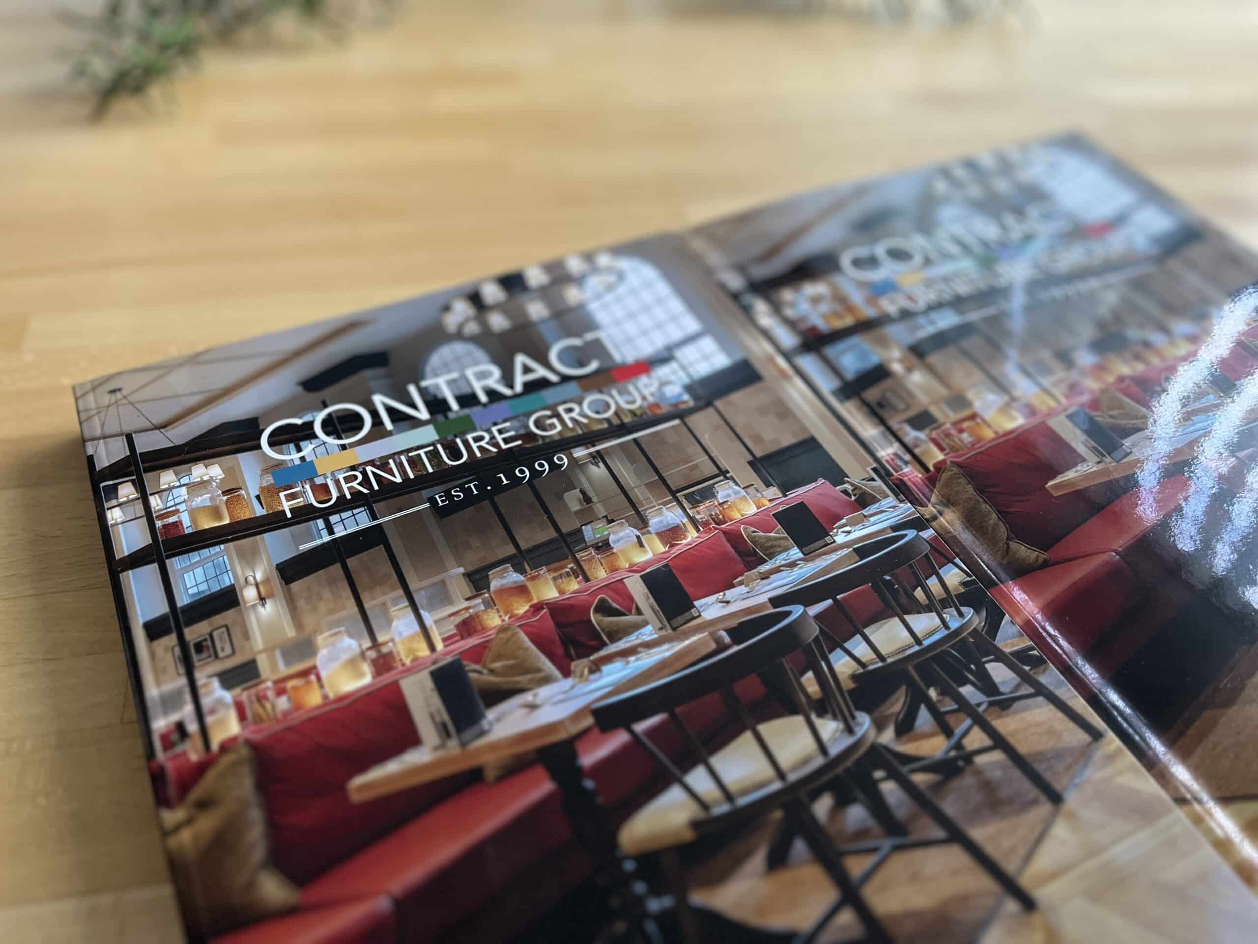
Soft touch lamination
Soft touch is a specialist finish that is not always appropriate, but when it fits, it tends to be noticed immediately.
The coating creates a velvety, almost rubberised texture that changes how the piece feels in the hand. It works well for premium product packaging, high-end brochures, and anything where the physical experience of holding the print is part of the brand message.
Where soft touch can cause problems is with durability. The surface scuffs and marks more easily than standard matt lamination, particularly on edges and corners. For a brochure that will be picked up once and read at a desk, that is rarely an issue. For something that will travel in bags, pass through multiple hands, or sit in a display for weeks, it may not hold up as well.
Soft touch also tends to sit at the higher end of lamination costs, and availability varies by supplier. It is worth confirming early whether it is the right option for your run size and budget before it becomes part of the brief.
Spot UV, foiling, and embossing
These three finishing techniques are often grouped together because they all add impact, and they all come with a higher price tag. The question is whether the impact justifies the cost for a given project.
Spot UV applies a high-gloss varnish to specific areas of a matt-laminated piece. The contrast between the flat matt surface and the shiny raised areas creates a visual and tactile effect that works well on covers, logos, and key images. It is effective at drawing the eye to specific elements without covering the whole piece in gloss.
Foiling replaces an area of print with a metallic, holographic, or coloured foil, applied using heat and pressure. It creates a finish that cannot be replicated with ink alone, which is why it is common on premium packaging and luxury goods. Gold and silver are the most widely used, but there is a broad range of options. The trade-off is setup cost, which can make foiling hard to justify on smaller quantities.
Embossing raises an area of the substrate to create a three-dimensional effect. Debossing presses it down instead. Both work best on thicker stocks, where there is enough material to hold the impression cleanly. On thin or flimsy paper, the result can look weak or distort the sheet.
All three techniques require specialist setup and cannot simply be added to a job at the last minute. They also require artwork to be prepared specifically for them, which is covered further below.

How the substrate affects what is possible
The substrate is the material being printed on, and it affects which finishes are even viable.
Lamination and spot UV require a base that will bond correctly. Not all materials accept coatings in the same way, and applying a finish to the wrong substrate can result in peeling, poor adhesion, or uneven coverage. Uncoated stocks behave very differently to silk or gloss coated stocks, and the same finish can look quite different depending on which one is used.
Weight matters too. Embossing and debossing need a stock with enough body to hold the impression. Foiling requires a smooth, consistent surface for the foil to transfer cleanly. Textured or heavily recycled stocks can cause adhesion issues with certain coatings.
If you are specifying a finish on a substrate you have not used before, it is worth getting a physical proof rather than relying on a screen preview. This sits naturally within a broader design for print process, where substrate and finish decisions are made together rather than independently.
Why finishing decisions need to happen before artwork is finalised
This is where a lot of projects run into trouble.
If spot UV is being added, the areas that will receive the coating need to be set up as a separate layer in the artwork file. If that is not done at design stage, it cannot simply be added afterwards.
Foiling and embossing work the same way. The shapes and elements need to be designed to work with the technique, not adapted to fit it later. A design that looks fine in print may not translate well to a foil or an emboss if the shapes are too fine or the areas too small.
The same applies to lamination. If a textured or specialist coating is being used, elements that rely on high gloss impact may not read the same way once the coating is applied. Colour can also shift subtly under different laminates, and dark areas can look different on matt compared to gloss.
Making these decisions after artwork is finished often means going back to amend the files. That costs time and can delay a job significantly. The quality assurance checks that catch these issues are far easier to pass through when the finishing spec has been confirmed from the start.
The most common mistake
Choosing a finish in isolation, based on how it looks in a sample pack, without thinking about the end use.
A soft touch brochure looks and feels excellent when you hold a fresh sample. It may look less good after three weeks in a trade stand display. Spot UV is striking on a business card, but if the areas selected are too fine, the detail can be lost in production. Foiling adds undeniable impact, but if the print run is 500 copies and the job is a leaflet for a one-day event, the cost will rarely be justified.
The right finish is the one that suits the application, the quantity, the budget, and the way the piece will actually be used.
Get the spec right before you commit
Finishing is one of those areas where getting early advice tends to save money rather than add to it. The wrong choice, discovered after production, is expensive to correct.
If you are finalising a spec and want a second opinion before the job goes to print, the team at Birch are worth speaking to. You can get in touch through their contact page and talk through the options before anything is locked in.


