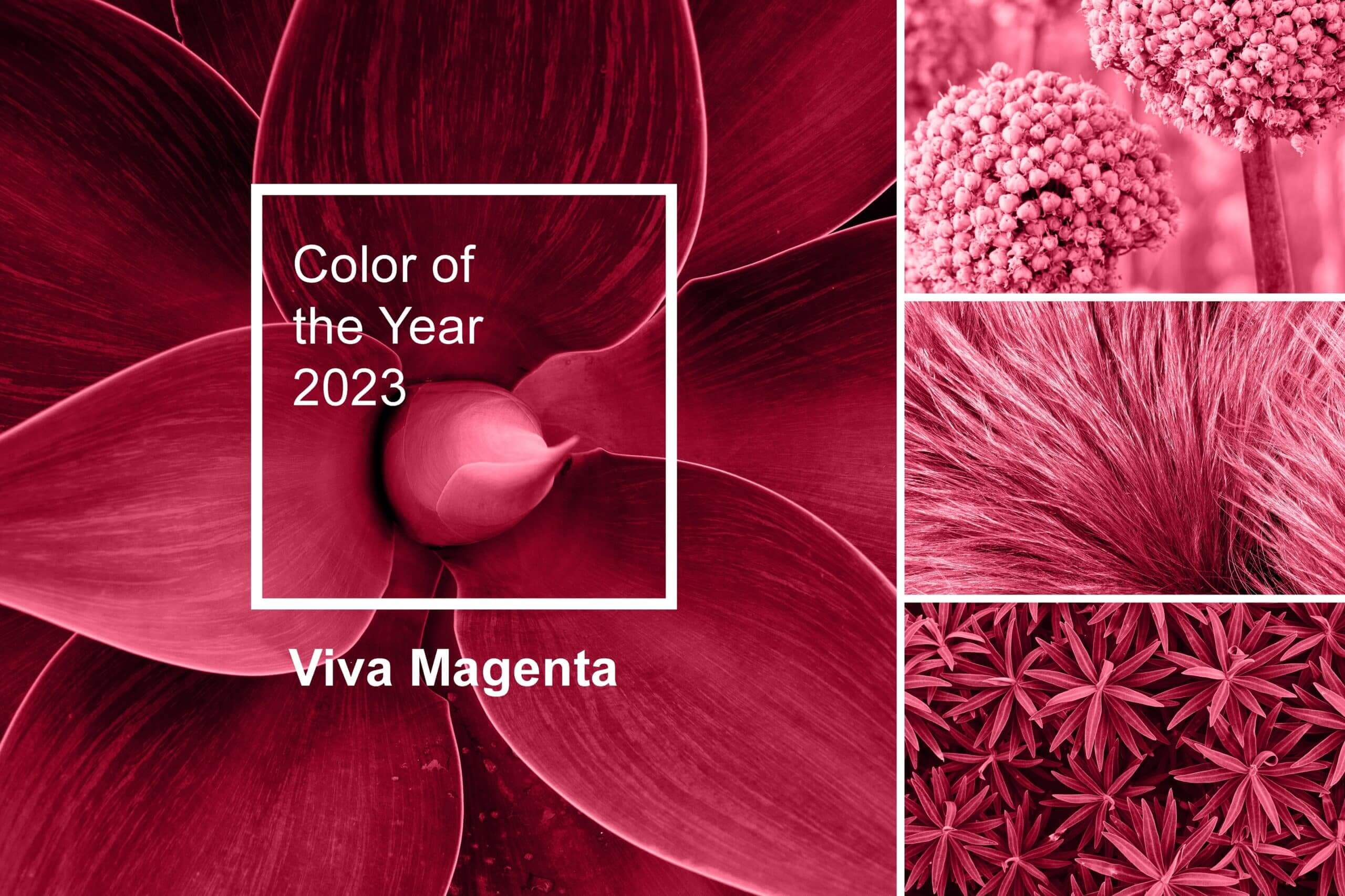
Last year the Pantone Colour of the Year was Very Peri 17-3938. This year it’s Viva Magenta 18-1750. Some of you might be wondering what these descriptive colours with long numbers behind actually mean? Well, not only does Pantone sound like the popular hair care brand Pantene, it’s also likely to influence hair colour trends in 2023 too!
The Pantone Colour System is a standardised colour matching system designed to help printers and designers across the world control colours during the print process. The Pantone colour reference is completely unique and stands alone from the CMYK digital printing process.
CMYK stands for the 4 following colours, Cyan, Magenta, Yellow and Black. The printing press uses dots of ink to make up the image from these 4 colours. In contrast, the Pantone colour is already mixed to your chosen colour so it will immediately improve your print output. A Pantone colour ensures consistency and continuity of your print projects especially if you’d like a specific shade of colour!
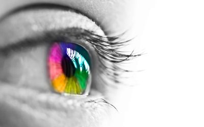
We’ve all probably described colours by a specific shade or by likening it to something, for example ‘mint green’ or ‘cherry red’ and the very nature of our vividly colourful world means that we all see colours in different ways. Colour captures our hearts and alters our mood which is why colour is an essential and very powerful component of your brand.
It’s hard to believe that the Pantone system encompasses over 10,000 colours! You’d think there wouldn’t be any more room left to create a completely unique colour each year but this is exactly what Pantone do.
In 1999 the first Pantone colour of the year, Cerulean (a pleasing sky-blue shade) was born. Every year since then, a team of global colour experts collaborate with the goal to continue the conversation around the fascinating field of colour. The Pantone colour of the year takes inspiration from every walk of life. From fashion, travel, and entertainment, right through to socio-economic conditions, the colour of the year is heavily influenced by what is going on around us.
The Pantone colour of the year is designed to encourage businesses to think about how colour affects consumer’s buying decisions, as well as inspiration for us all to consciously think about the impact colour has on those around us.
Viva Magenta is bold and empowering and our team love it! There is no shying away from this stand-out colour and we look forward to seeing splashes of Viva Magenta this year.