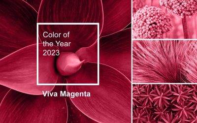
Colour is just a colour, right? Black is black and white is white, isn’t it? Not quite. Those of us in the print world know there are a million shades of grey that can play havoc with our print output.
Business owners spend a vast amount of time choosing the right colours to represent their brand. There is a lot to think about. What colours should your logo have? How will the suite of colours be used across print and digital marketing? Some brands use a suite of similar colours like a pastel palette, for example. Others will have an array of colours to choose from! Whatever the colour mixes, keeping those colours consistent across digital and print is the next big challenge.
How can we keep colour consistent?
Have an eagle-eye!
Our industry requires an extremely detailed eye to spot those colour discrepancies. In fact, most job descriptions for the print industry should state ‘must be eagle-eyed’ as a pre-requisite!
Use a pantone swatch book
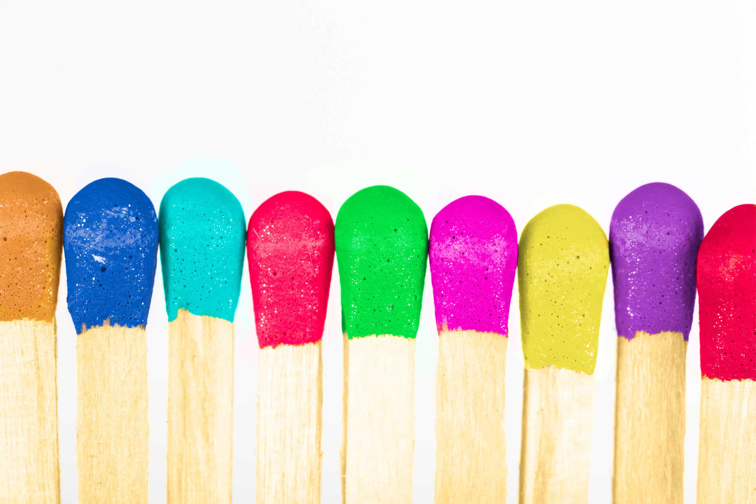
Our daily screen usage means it’s more likely for business owners to choose their brand colour from a digital device. We’d advise against doing this because printed colour is created using the four-colour process (CMYK) and is usually more toned down, unlike the bold colour output from a screen which uses RGB (red, green, blue). Use a Pantone swatch book, but always be cautious if colour consistently is absolutely critical. Even with a Pantone swatch book, brand colours can vary once printed depending on the materials and print process used.
Test and colour match
If we could print on just one material, then things would be so much simpler. Unfortunately for consistent colour matching, the sheer number of materials and print finishes makes it more difficult to get colours to align. Always test your colours with a print proof first before any mass printing. In some cases, testing needs to be done more than once!
Our team recently completed a product packaging project for Laundry Leaves which proved to be a challenging colour matching process. During the proofing stage, we noticed that the brand’s red came out perfectly fine but there was a huge discrepancy in their brand green. The colour mismatch was obvious, even to the most inattentive eye. Our job is to provide colour consistency and maintain brand integrity across all our print portfolio, so our team carried out numerous proof checks until we got it right.

Colour matching is an intricate process. On some projects with particularly troublesome colours, there may be several tweaks to the different ink values in the printing press before the desired colour is matched. In our industry it’s not uncommon for lots of trial and error!
Preventing issues prior to press
It’s useful to gen up on pre-print file types and which types should be used for which project. If you have a pantone reference, share this at the beginning of the project with your print provider to allow your provider to select the correct printing method and avoid huge colour mismatches during proofing.
Even with these handy tips, it’s important to bear in mind that printed colours will never be 100% perfect, but as experts in the print field we’ll work hard to create the most accurate colour possible for you and your brand.